🏆 Main Project / Special Winning Piece
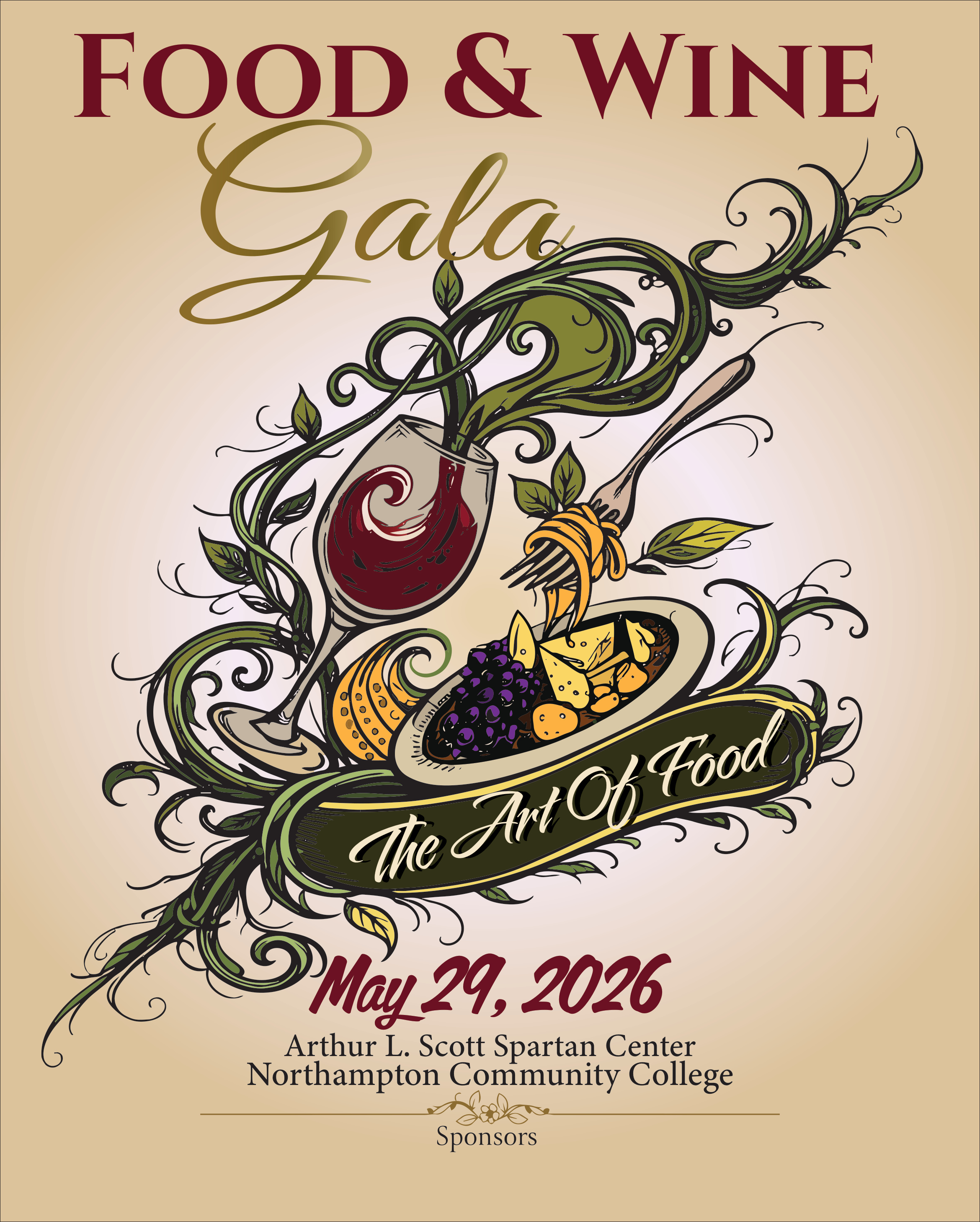
Northampton Community College Food & Wine Gala Poster
Created: April 2026
Software Used: Adobe Illustrator
Tools & Techniques: Pen Tool, vector illustration, custom typography, gradients, layering, color harmony, composition, type hierarchy, bleed setup, and print preparation.
Project Description: The objective was to design a professional event poster for Northampton Community College’s Food & Wine Gala. I created an elegant illustrated poster using wine, food, vines, and decorative movement to communicate the theme “The Art of Food.”
Learning / Achievement
This project represents one of the biggest turning points for me this semester. At the beginning, I approached design more instinctively, focusing on making things look good without fully understanding structure and flow. While working on this poster, I started to think more like a designer and less like someone just experimenting. I learned how to control composition and guide the viewer’s eye using movement and organic shapes. The vines were not just decorative; they became part of the structure that connects all elements together. I also improved my use of typography by integrating it into the design instead of treating it as something separate. Another important lesson was balance. I had to manage multiple elements like the wine glass, food, and decorative lines without making the design feel crowded. This pushed me to refine spacing, layering, and hierarchy. Winning recognition for this project made me realize that I am capable of doing more than I thought, and it motivated me to keep improving and taking my work seriously.
Self-Reflection & Critique
Describe: The final design is a decorative, high-end event poster with wine, food, vines, and expressive typography. Analyze: The movement of the vines helps guide the eye from the top title toward the central illustration and down to the event information. Judge: I think this is my strongest piece because it feels complete and professional. Its strengths are the movement, color palette, and visual storytelling. A weakness is that the center area is busy, and some details could be simplified for stronger readability.